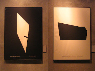


Poster Triennial this year is more or less the same as previous years'. Perhaps the more your database expands, the less surprise you get from 'new' candidates. Who can defy that creativity does not bear the burden of history? Interestingly, I read the following article on a site the time I draft this post, featuring a small exhibition Typo China around two years ago. What this German said was actually phenomenon found in our Chinese design arena for long. For those who haven't been to the show yet, I hope after reading the passage you take another perspective in looking at these all-too-similar artworks and figure out a 'global picture' which is highly obvious if you do pay attention to them holistically. 'A poster is intended first and foremost to be seen, not read.' Perhaps anything analytical is just extra but I do believe a poster possesses its own power. After drawing your first sight, it wants you to walk away with something in mind and that is the enchantment of it.
Typo China - zeitgenössische Schriftplakate aus China, Museum für Gestaltung Zürich, Plakatraum, 3. Mai - 4. August 2006
Chinese posters had caught our attention some time before, as a satisfying contradiction of ideologically driven rigidity. The development of the poster in Hongkong and Taiwan may be ahead of the People's Republic, but seen overall this is a very recent years. Various international poster competitions have been instituted in China since the late 1990s, and here the designers want to lay themselves open to Western judgment as well. It is striking how frequently their posters focus on the characters, showing their desire to keep up with the times in terms of the unique richness of their own typographical culture. This was not the only reason why it seemed right to us to concentrate on choosing typographical posters. Chinese characters have a visual quality and a semantic complexity that go far beyond the possibilities our alphabet affords.
Our appeal to submit new works met with considerable enthusiasm. This gives a sense of the vitality of a group, small as yet, of young designers who are discovering international competition mechanisms. It is typical that many of the posters shown were produced on the designers' own initiative, because China still lacks clients who are prepared to commission posters; and thus has no real poster culture. So this selection is as welcome as it is provisional, and fits in with our attentively skeptical yet hopeful view of "booming China".It goes without saying that the fascination with Chinese typography we have succumbed to is fed on ignorance. Chinese text often affects us simply as a texture, because we do not have the necessary translations skills to be aware of the posters' expressive quality.
So can we do justice to these posters at all if we submit them to our usual selective scrutiny? Yes, if we are prepared to play by poster competition rules. For there too we make what we should see into what we want to see. And there too every poster operates by taking mutual clichés and expectations into account. Something that is part of the essence of a poster is always the perfect concession to positive misunderstandings: a poster is intended first and foremost to be seen, not read.
Felix Studinka [www.hesign.com]


No comments:
Post a Comment